What YouTube looked like in 2005
This particular post has been sitting in my drafts since July 2008 after the iLab guys and I started looking at the similarities between YouTube’s logo and another South African company. This spurred on an analysis of the evolution of YouTube since it’s beginning and it was fascinating for me to see how the site evolved over a 12-month period during 2005.
The following screenshots (taken from the WayBack Machine) highlight the key design and functional changes during this period.
There was very little detail available for April 2005 however what I did find interesting was the drop downs that indicate that YouTube may have been somewhat of a dating site. I can’t seem to find any reference to this apart from the screenshots and if anyone has any info I’d love to know.
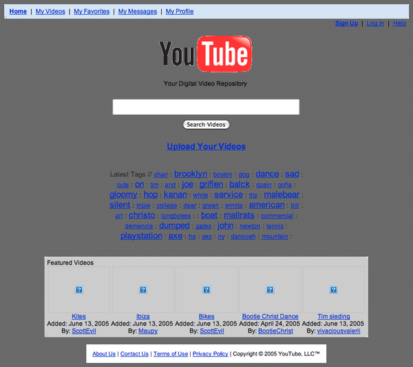
In June YouTube introduced search as a dominant feature on the home page and a new tag line, “Your Digital Video Repository”, is conceptualised.
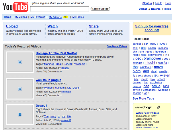
By August the classic YouTube is launched with search remaining as a dominant feature however more priority is given to featured videos. This is the first time that YouTube really looks functional and easy to use. Very smartly YouTube drops the stupid “Your Digital Video Repository” tag line and changes it to a more functional one liner, “Upload, tag and share your videos worldwide!”. What’s also interesting to note is that this new design highlights the start of the relationship with Google with the introduction of Google Adsense code in the sidebar.
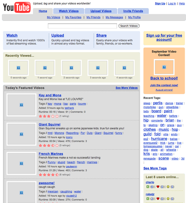
Not many changes in September from August but YouTube have now introduced the Recently Viewed functionality to the home page as well as a new Last 8 users online sidebar.
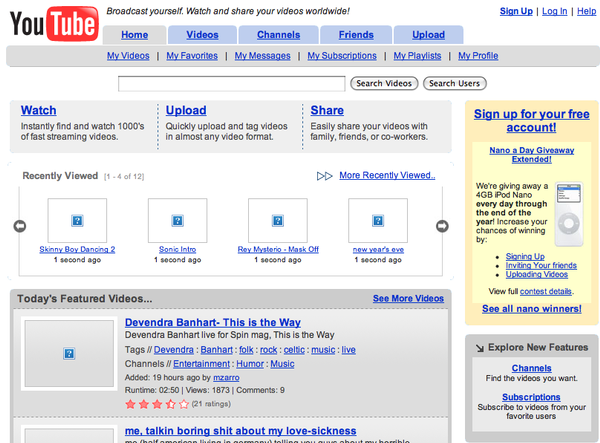
While there are some minor design changes in December the highlight of this screenshot is the introduction of YouTube’s now trademarked tag line – Broadcast Yourself.
I love looking at the evolution of main-stream products and what I particularly liked about YouTube’s evolution is seeing how they struggled to position themselves with their tag line. In Afrigator‘s case we’re constantly trying to work on our positioning and we’re yet to find the killer one-liner. It’s good to see though that as a product evolves along with functionality and simplicity so does the positioning and I’m optimistic that we’ll figure this out with time.



Comments ()